The most important part of your brand is your logo. And one of the most important elements that make a logo stand out from the rest, is the choice of typography. Whenever we design a logo, we pick the font that fits the brief, and overall look of the logo, but sometimes, it comes down to the client’s choice.
Here we break down the factors to help you make that important choice.
1: Identify your brand.
The most important step is understanding who you are as a brand, what personality do you want to emit? Are you a well established law firm, with a serious stance? Or a social media advertising agency, with a younger hip image?
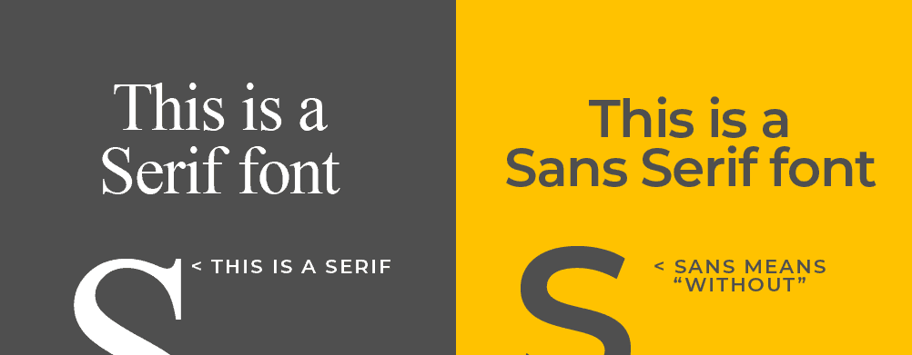
A serif font helps define a serious, high end look. Often used for doctors, lawyers, and classic fashion houses.
A sans serif font caters for a more modern look, and can be used for tech companies, advertising agencies, and others that want a younger vibe.
Understanding the difference between these 2 styles of fonts will help you pick the right path for your brand. So what is the difference?
2: Serif and Sans serif explained.
This is probably easier to show as an image…so here goes:
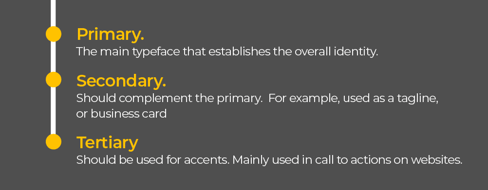
3: Establish your overall brand look using typography hierarchy.
Now that you have your logo, with the font that you chose, your design should now think about matching fonts to the logo for other design applications, such as websites and social media designs, etc..
A typical typography hierarchy should look something like this: