
A quick history on the font, and why I love it.

This whole post was sparked by a can of craft beer I had last night (apart from graphic design, craft beer is my slightly unhealthy passion in life)
The beer in question, “Haze is the place” a Hazy IPA from Morenos (A Mexican brewery) and its label. As I was drinking it with my wife Elisa, I decided to bore her with a bit of font spotting, and told her the font used on the label is called Cooper Black, and went on to tell her what I’m about to tell you.
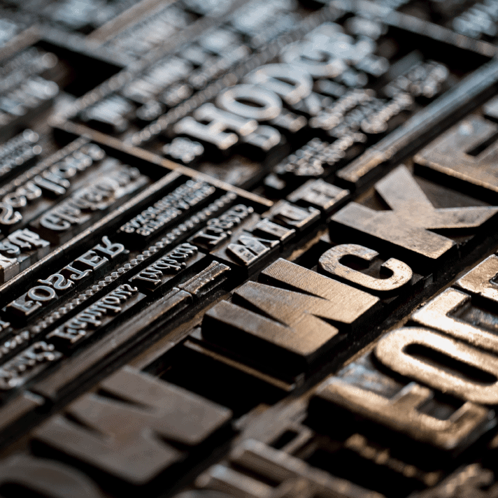
Chicago, 1919, World War One had just ended, and the world, particularly the US, had an upsurge in productivity, and this called for more advertising, and the most popular medium back then, was newspaper ads. Back then, printing was still done using pieces cut out of either metal or wood.
Metal became the more popular method of printing due to the Guttenberg press (I will save that story for another day.) and allowed for more precise, and smaller letters, giving birth to the mass printing of newspapers, magazines, bibles etc.
Oswald Cooper was an illustrator and worked on many a custom typeface, hand painting them for each advertisement, but now with the powerful metal presses, and the speedy linotype presses, this opened up the possibilities for him to produce a fully fledged typeface to use over and over again. The typeface Cooper was born. He basically took a standard serif font and made it softer and rounder, slightly more soothing to the eye.
The type foundry Barnhart and Spindler saw his work and asked for a bold font based on cooper, for use in headlines and adverts. 1920, Cooper Black was born and had instant success.
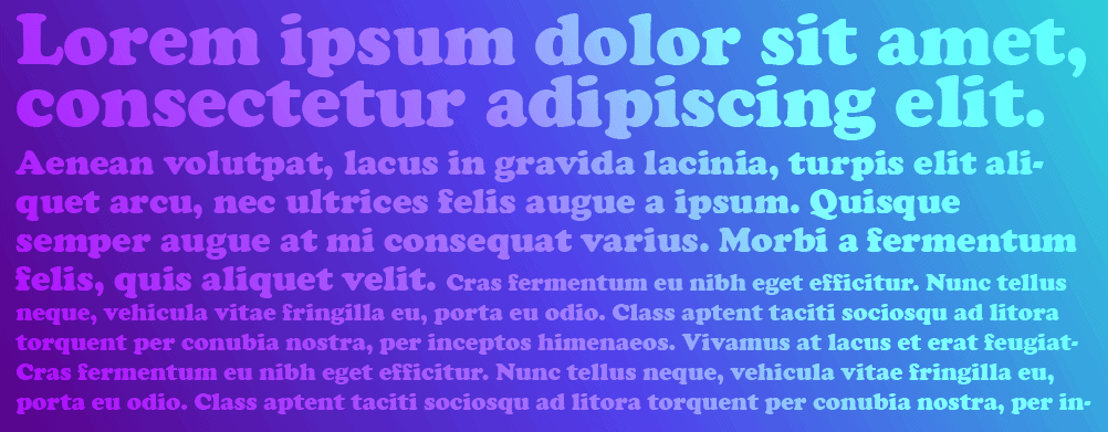
Why was it so popular? Well, just look at the curves! It was unlike any other font at the time, and curved parts that previous fonts didn’t dare, like the bottom “feet” of the font, it looks like a standard, kinda boring font has had life literally blown into it like a balloon. The curves also helped the font when being printed, it was much more forgiving, and didn’t look that bad with mistakes in there, like a crooked font here or there.
Some of my favorite letters are the lowercase letters f,g and the O. The f, made great use of the limited rectangular space used with the letterpress printing of the time, you can see here how it neatly fits inside the rectangle and makes full use of the space. The g is just a great looking letter, that cheeky horn to the top right, you could make a logo using just this letter. The O is unconventional, and fun, most typefaces have the space inside the O set in a very vertical manner, whereas Cooper Black has it tilted back, making it a little more friendly.
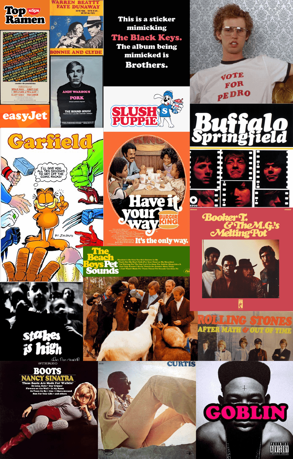
As the print technology evolved, it became much more accessible, which allowed for greater creativity. Cooper Black was the star of the DIY poster/flyer’s of the 60 and 70’s, which influenced the movie industry and advertising industry a great deal. Cooper Black started popping up everywhere, from posters, to adverts, and your local store, it had never been more popular.
Below, I have created a collage of Cooper Black being used in popular culture, let me know how many you recognize, and if I have missed any in the comments.
If you are interested in my personal obsession with craft beer (and my personal logo creations) check out my Instagram here.