

The design of the Tabasco sauce bottle and branding, I find so simple in its execution, here’s why.
![]()
The actual design of the logo is very simple. If you break it down, it is basically 2 geometric shapes, a circle and a square. Plus the name and other wording in just 2 colors. It is, nothing special, but at the same time, this is why it works so well. Some of the best logo designs in the world are the most basic, think Nike, its just a tick/swoosh. So what makes this logo and others, so memorable? the answer to that is good branding.

The whole design of the Tabasco brand revolves around 3 colors. Red (the actual sauce color), green and white. That’s it, just 3 colors. Now the beauty of the bottle, I think, is pure genius, its that metallic green wrap around on the neck. Think about it, whenever you are in a cafe, or restaurant, you instantly know that the bottle you can just see the neck off on the next table, is that bottle of hot sauce you need. You can instantly recognize it when you see it in a TV show or movie scene.
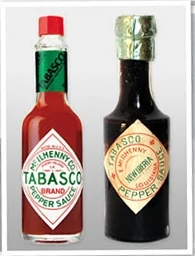 The design of the bottle and the label hasn’t changed much from the early design to now. It still has that same diamond shape, and simple logo, but its that green wrap on the neck that makes it stand out form the rest of the hot sauce crowd. So when clients come to us with very complicated logo ideas, that want to shout what they do, we tell them no, think about it. A good logo should be simple, and memorable, what makes it memorable over time, is good branding, so its not just about the logo design, its about the rest of the look of the brand that is important too.
If you need help with your companies branding, get in touch.
Yup! at times its necessary for your product to make some innovative changes to attract the maximum users……..